Rainbow Sky Community Complex
Overview
Our objective for the community centre is to revive and inject vibrancy into the neighborhood while making it inviting for people of all ages to engage with the program offered by the building and the site. We went with the theme of “play”, using symbols like “rainbow”, colors and open outdoor green spaces and essentially mini-parks to allow residents to explore the space. The entire design is guided by the necessity to project a vibrant and playful social energy around the site and the connected areas. To make inviting for people to hang around, relax and engage in communal activities The unique features of the site allow it to stand as a landmark piece in the neighborhood, but to remain approachable and convivial.
Context Analysis
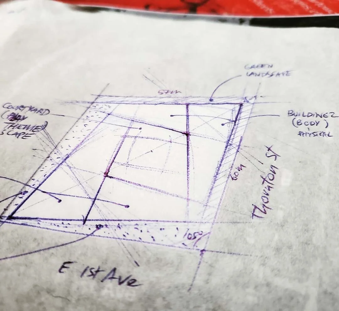
The area is surrounded by residential zones on the south, a closing road with trees (Thornton St), access from East 1st Avenue, and two additional lots that lead to the Emily Carr school building. There are a range of parking spots near Carolina Street and Equinox Gallery. Transit access is decent. For the most part, the entire area is relatively muted or dull in terms of human activity. Engagement in the neighborhood is low. There is plenty of open space on the lot and direct access to sunlight. The inclination of the lot area makes rain drainage naturally manageable.
We are looking to respond to the context by envisioning a community centre building that primarily encourages through its exterior and interior, residents, passerbys and other people living in the area to engage with it and to look forward to meeting other members of the community. A building that facilitates bringing people together and that memorably responds to the cultural expression of the area, and lightens it up through reinforcement and novelty. Finally, we will want to contrast the large unstructured open spaces (the two lots leading to Emily Carr) and equally continuate on the series of trees from Thornton St by surrounding the community centre structure with green landscape motifs and eco-friendly features that allow the visitors to engage with nature and the local climate (e.g. take advantage of the rain). For this community centre, the central thematic vision is “Play”.
Context and Form
We went with two mass structures that balances the topology of the site (the second building is inclined to reflect the inclination of the road on 1st Ave). The two buildings are connected by a suspended corridor with full glass window. The shape is in conversation with the surrounding buildings by maintaining a contemporary look and by displaying a prominence of glass window across most of the walls. Outside of the glass predominance, the rest of the structure are white wood material. The color brings a subtle but effective sense of neutrality or purity to the building (note that a light shade of grey could be an option too). The wood structure makes the buildings feel warm and approachable; connecting with natural materials

Outdoors
- The courtyard: The courtyard is an open space sitting at the center of the site and articulated the pathways and line of access to various activity areas. It is also meant to serve as the main vibrant area where temporary activities can be organized and residents can have fun.
- A small horticulture structure: This structure is designed using mesh materials that wraps around the spaces. This allows the plants to easily breath out and invite the residents to engage by making it possible to peek into the structure. Additionally, the modern structure and shape, sitting directly in connection with the road, easily attracts passerbys to engage with nature and plants. More over, the primary stair entrance to the site cuts the horticulture structure in two, further allowing visitors to engage with it or at least have a pleasant walking experience.
- Rainbow colored entrances: There are three corners of the road asphalt on site that are colored using rainbow shades. This is to further accentuate presence of the site. The accentuation is necessary to compensate the fact that by sitting in a depressive zone, the buildings and site are not necessarily the most welcoming (they are not on eye level). By providing these guiding lines, painted with colors that are supposed to communicate lightness, playfulness and curiosity, we allow the site to be more appealing to the visitors and a passerbys. A usage of low-saturated colors is likely ideal.
Nature and Form
Where the site is dominated by on thornton st and 1st ave by grass land and the horticulture structure, their opposite roads articulate a “mini-forest” of high trees and shallow rivers. This area is meant to provide a walking or biking experience similar to ones that can be found on sites like Stanley Park, though, at a much more micro scale and much lower height. The paths are punctuated with child activities such as a labyrinth, micro-sand pits and other popular child activities. These are also targeted to adults to bring out their inner-child.
Connectivity/Path Connectedness
In-between building corridor: This corridor represents the transition between the primary area of the site (containing the courtyard) and the back of the site (a mini-forest with rivers, playful spaces and bike and walking spaces). Bike and walking paths: Walking paths crossed the site in an “X” shape to join at the courtyard. This emphasizes the courtyard space as a central outdoor feature of the site. A place where residents and hang out, sit, chat and engage with the facilities of the two buildings. The folding stairs: A playful back structure which connects the back roads to the site’s “playground area”. The folding stairs exploits the fact that although the 1st Ave is inclined, the opposed street on the other side is not.
